A neighborhood crime map using Shiny
Shiny has been on my list of things to learn for quite a while now. With it you can make interactive web apps straight from R.
With this in mind, I built a simple app that accesses crime data from the City of Dallas and maps the locations in my neighborhood. The app can be found here. This accesses the latest data from the City of Dallas’ OpenData API which is updated daily.
The main features are illustrated below (and yep, there’s a Hollywood Santa Monica in Dallas!):
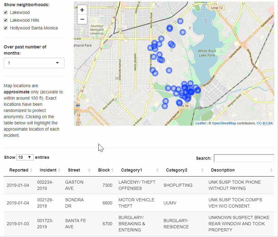
As can be seen, the app allows the user select the neighborhoods they’re interested in, and then displays incidents occurring in those neighborhoods over the selected time frame (from the past month to past three years).
Note that to preserve the anonymity of my neighbors, I added some random ‘noise’ to the location data, so that the points displayed on the map would be within around 150 feet of the actual location.
The concept of Shiny is brilliant: it allows you to provide a user-friendly interface to your R code (like a dashboard) which can be accessed through a website. The user does not need to see any of the underlying code, and, because it is web-based, does not need to download anything. Your app can be hosted for free at Shinyapps.io (though the free version is subject to limitations on how long it can be accessed each month).
Technical stuff
All the code used to produce this app is available on Github. The main steps were as follows:
- Access the data from City of Dallas API. The data was read using the jsonlite package, with help from the soql package to construct the URL needed to access the relevant ZIP codes.
- Filter the data to exclude incidents where there was not an actual offence, such as false alarms.
- Create longitude and latitude columns. The downloaded data included a ‘geocoded coordinates’ column, but I couldn’t get this to play nicely with my map. I converted this to separate latitude and longitude columns, which worked fine.
- Create shapefiles of my local neighbourhoods. I wanted to identify incidents that occurred in specific neighborhoods, as opposed to the wider ZIP codes. I could not find these boundary maps online (in the form of shapefiles), so I drew them manually in Google MyMaps. These boundaries could be downloaded as .kml files and converted to shapefiles here. The shapefiles were then read into R using the
readOGR()function. - Only show those incidents occurring in relevant neighborhoods. The next step was to identify those incidents whose coordinates fell without the neighborhood boundaries described above. This was done using the
over()function. The data was then filtered to only include those relevant incidents. - Randomise locations. To preserve the anonymity of my neighbors, I changed street numbers to block numbers and added some random ‘noise’ to the coordinates of each incident.
- Create the Shiny app. The app essentially plots all the incidents on a map using Leaflet. The incidents shown are filtered based on two sets of values entered by the user: the relevant neighborhood(s), and the time frame. The user is also able to click on the table to select an individual incident or incidents. This selection serves as another input, filtering the data to only include the selected incident(s) and overlying this second set of points on the map using red markers.
The final step was the hardest, given the learning curve associated with Shiny. However I was able to learn 90% of what I needed from this excellent DataCamp course, Building Web Applications in R with Shiny.